Mobiles are important. So important in fact that according to a study in 2016 mobile users touch their phones on average 2617 times a day! That’s some excessive phone fondling going on!

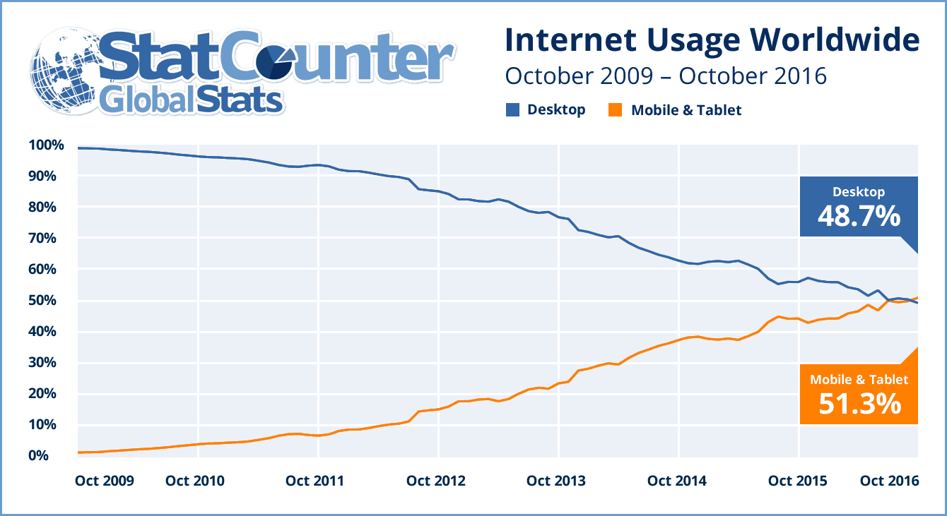
You’ve just been diagnosed as a mobile phone addict, but good news: so too have your customers. And clearly, this shows how important mobile devices are as a means to reach your audience. Take your website for example. All of this phone-grappling means more users are viewing websites on their phone. In fact, over 52% of the world’s website traffic is generated by mobile phones. A trend that is set to continue.
But what does this mean for the average business? We know websites are hugely important for businesses, but the importance of optimising your website for mobile may be more of a mystery. Well, wonder no more – paying attention to how your website behaves on a mobile device may just be the best bit of business research you do this year.
Google Loves Mobile
Your fingers aren’t the only things interested in mobile. Google’s web search bots, also known as spiders, are now officially preferring mobile-optimised sites over their desktop counterparts. This means that how well your site performs from a mobile perspective influences your site’s ranking in Google. That’s a huge change made by Google and one that could have a major impact on your website’s search engine ranking – especially if your site’s mobile experience has been just an afterthought up until now.
For more information read this insightful blog post “Google is putting mobile friendly first – have you?” written by our very own digital marketing expert, Carla Hyland.
Designing the mobile experience
So after getting your site to climb the search results rankings, your users have been able to successfully find your site and with one simple thumb tap have entered your website on their mobile device. Fantastic you may say! But what greets them once they get there? Is it hard to navigate, impossible to see clearly and requires the thumb endurance of a seasoned hitchhiker to scroll through?
With a smaller screen comes a number of mobile-specific website design problems to solve. Because a mobile display is much smaller than a desktop monitor, the content of your website needs to be arranged for a better experience when viewing it on mobile. This includes mobile responsiveness, speed to load and special design considerations like how a customer’s purchasing journey may be affected by a smaller display. In fact according to Google…

This shows that users are becoming increasingly comfortable using their mobiles to research and then purchase products. A fact well worth considering when designing your website.
Speed Considerations
In many cases, users will be using mobile data, not WiFi, to connect to the internet and view website pages. This is a problem when you realise that 70% of these connections globally occur at 3G or slower speeds.
Users on these connection speeds already struggle with slow load times on their mobile and will not be too enthused if your website has unnecessarily large content like images or videos to load. 15.3 seconds is the average load time for a mobile page, but it takes much less time than that for users to become frustrated enough to give your website the flick and move on – maybe to a competitor’s site. If you are concerned that users may be ditching your mobile site for a faster one, you can test your site’s speed using this handy tool as shown below.

So… fact confirmed. Mobile is important. In fact…

That’s a pretty big endorsement for having a website optimised for mobile.
Mobiles are being used far more today than they were just a few short years ago, and no-one is predicting this trend to stop anytime soon. This makes a mobile-optimised website a valuable tool for any business or company that is looking to stay relevant to its users.
At Mogul, we understand just how important mobile has become and offer a wide range of packages with mobile-first considerations at their core. For more information on these please get in touch.
