Client: “Can you make the logo bigger?”
Designer: “?”
This question is about as old as time itself and has plagued fascinated designers for generations.
In my previous incarnation as a print designer many years ago, I was often asked to make the logo bigger when making brochures, posters, fliers etc. Now I’m asked the same question in the various digital mediums.
The question is fascinating to ponder and it leads to two more questions: “Should we make the logo bigger?” and “Why does the client want it bigger?”
I’ve often dabbled with this, and today I hope to get to the bottom of it. There needs to be some kind of definitive answer, a formula to guide us through the murky darkness. This is the desired conclusion of this post, I do hope we get there, for I feel it is an honourable goal.
Be warned: we might find ourselves deep in psychological assumptions and weird tangents but hopefully we’ll get there.
OK. What is a logo?
Let’s start with the basics. We all know what a logo is. We can summarise it as text or iconography, often used together to form a symbol. But it’s not just any symbol! This is THE symbol the company rallies around like a crown jewel. It’s the face of the company, and other people must know of its coolness and what it represents. A good logo conveys the meaning or general gist of what the company does quickly and effectively.
So we know that the company sees their logo as their baby, that they are proud of it and want to show it off. Hence the emphatic desire to see it in lights.
Now, where is this logo? It must live somewhere… we find that it lives in a lot of places. We call each of these places a medium.
The medium
The medium is of critical importance in figuring how big the logo should be. We could call it the ‘Arbiter of Magnitudes!’ … or just the medium. Let’s go with ‘the medium’ for now.
The medium could be a sticker, flier, billboard, car decal, website or anywhere else the logo appears. If we take into account where the logo will be used then we can start to create our formula.
But it’s not just the medium that should dictate how big the logo should be. We also use brand campaigns and these need to be taken into account as well.
The brand campaign
We use branding campaigns for various reasons: to make people take notice the company, to portray the company in a certain light or feeling, or just to push a certain product or service the company might be selling.
How does the campaign affect how big the logo should be? Well, in the design world it’s all about hierarchy and white space. If everything was big then nothing would be big, and if everything was crammed together it would be hard to differentiate the parts. So we try to make things easily digestible through the hierarchy.
In a branding campaign, you might lead with an image, tagline, or video that helps to illustrate the campaign’s ideas. The logo should accompany and support it, not try to take over the medium with its self-importance, The logo knows it’s the big dog, it doesn’t have to tell everybody.
For example, if the medium is a video advert then you might lead with the message strategy and end with a shot of the logo with maybe a little tagline. Think about how many times you’ve seen this exact thing on TV. That’s not to say you can’t change it up though – that actually can be a strategy too, but this hierarchy has a general rule in a branding campaign.
- Sell the idea, not the thing
- Convey the essence in tangible ways
The medium: website
Now, these days the website is like your brand HQ … but you can’t just show someone a website, unless you shove your phone in someone’s face. You have to get them there and this is part of the journey.
Let’s think about it. The user is searching for a service or product that your company provides and (with good SEO or paid ads) finds your website… and if your SEO and ads are good, they should already know what your company is called and what you do before they get there. By the time the user gets to your website they already know what to expect, and they don’t need a large logo to tell them where they are.
This is when you can lead with your brand campaign or your main value proposition. There’s no point wasting good real estate on something they already know about. In this case, the logo should be clearly legible and small/medium in size, so that it fits and doesn’t make the navigation bar too deep.
The medium: sticker
Now this is about as different from a website as it gets. A potential customer could stumble on a sticker anywhere. Stickers are usually small, so they only have room for one or two things. One of these things needs to be your logo, and the other should probably be your website URL to learn more about your business. In this case, the logo is big.
There will be other places your logo is used and you might be asking yourself how large the logo should be in each case. Well friend, I have worked hard to give you some semi-valuable insights!
The formula 💎✨
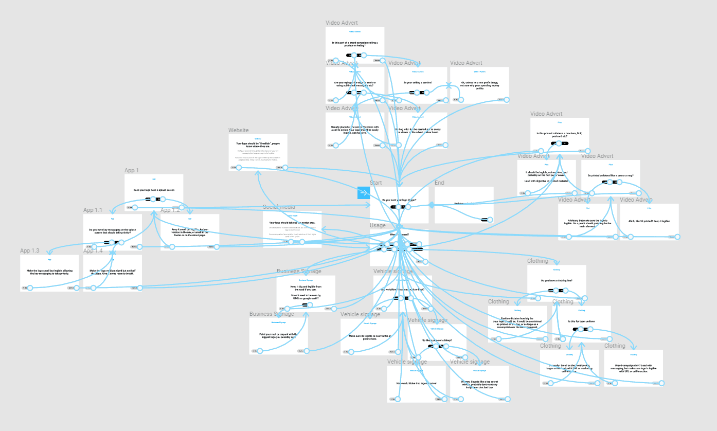
Below is prototype click-through formula (created in Figma) to help anyone with this same issue.
Still want your logo bigger?
If the formula doesn’t help and you still want to make your logo bigger, you might need to invest in some logo cream.