Your website’s navigation is one of the most important things to get right. How you allow someone to navigate your website can have a major impact on the user experience. In this article, I discuss the most popular as well as the most criticised navigation pattern – the hamburger menu.
The hamburger menu (the three stacked lines) was originally intended as a solution for mobile devices in responsive design. Since then it has taken off, and for better or worse has become a common element in today’s design. But because of this, a lot of posts have been written about the hamburger menu, mostly by UX designers, arguing against its use beyond mobile devices. In short, the issue isn’t about the icon itself, as an icon will hide content from users, but rather if we should be hiding the navigation or any information for that matter from users at all.
So what’s the beef with the hamburger menu?
The main argument of the hamburger menu is its low discoverability. It hides the content behind a curtain and forces the user to perform an extra and unnecessary click. This pattern introduces navigation friction since it forces people to first open the menu and only then allowing them to see and reach their objective. Not only does hiding a menu create an extra click, but it creates it over and over again. Every time somebody wants to go to another page, they must go through the repetitive action of clicking the icon. In addition to this, when you hide navigation, it inhibits the ability of people to discover unexpected content on their own. Out of sight, out of mind.
There used to be the argument that not all users would understand the meaning behind the icon, especially the older demographic, but the hamburger menu is now so ubiquitous, you’d find it pretty hard to find someone who didn’t recognise it or understand its purpose. Check out Hidden Navigation Hurt UX Metrics by NNGroup if you want to read more.
But just like the delicious fast food itself, it’s not all bad.
Cleaner user-interface and design
One of the worst things you can do when designing a website is to overload your users with choices. Providing users with too many options can lead to decision fatigue – where they feel overwhelmed by the choices and either make a poor decision or abandon your website altogether. While we want users to be able to reach the end goal quickly, sometimes it’s better to take them on the journey to that goal first.
While we strive to find the perfect balance between form and function, sometimes we need to make a compromise. If the aesthetic of a website trumps usability then the hamburger menu affords a simple, elegant and minimalistic aesthetic that keeps everything tucked away neatly. The pure visual simplicity it brings is appealing and it instead allows the user to focus on the content on the page itself. By placing more importance on the page and removing extraneous options – you provide a clearer direction and path for the user to follow to get to the goal of the page.
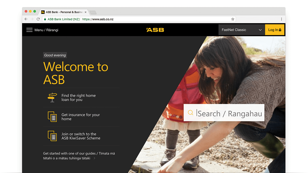
ASB do this to good effect. Putting the primary navigation into the hamburger menu instead places more focus on the search bar – encouraging users to navigate the site this way. The predictive and autocomplete search provides a quick alternative for users to find specific content without having to fumble around the site.
Can you have a bit of both?
Trying to meet somewhere in the middle and mashing different interface patterns can often end badly, but using the burger menu for your secondary navigation can actually be an effective solution. It allows the primary navigation to remain visible and available at all times while hiding any secondary options that may distract the user from the primary tasks.
Conclusion
Hidden navigation is often labeled as a ‘bad’ user interface pattern, but deciding if the hamburger menu is an appropriate interface solution – whether for mobile or desktop – is a decision that can only be made in the context of its application.
Good design is about good solutions. Understanding the context, your users and your objectives will lead you to the right solution. If you choose to use the hamburger menu or not, remember that the end goal is the same – improving the user experience.
