
I have been known to clap my hands with joy when UX design comes up in conversation – not because it’s the new hot topic – but because user-first is how we have approached website projects since 2007, way before before it was one of the top five in-demand skills according to a LinkedIn report (2020)*.
So what is UX design? Put simply, it’s how a user interacts with a product/platform/service.
Done well, the experience should be easy, seamless and enjoyable. When it’s done badly the experience will be jarring, disappointing and frustrating.
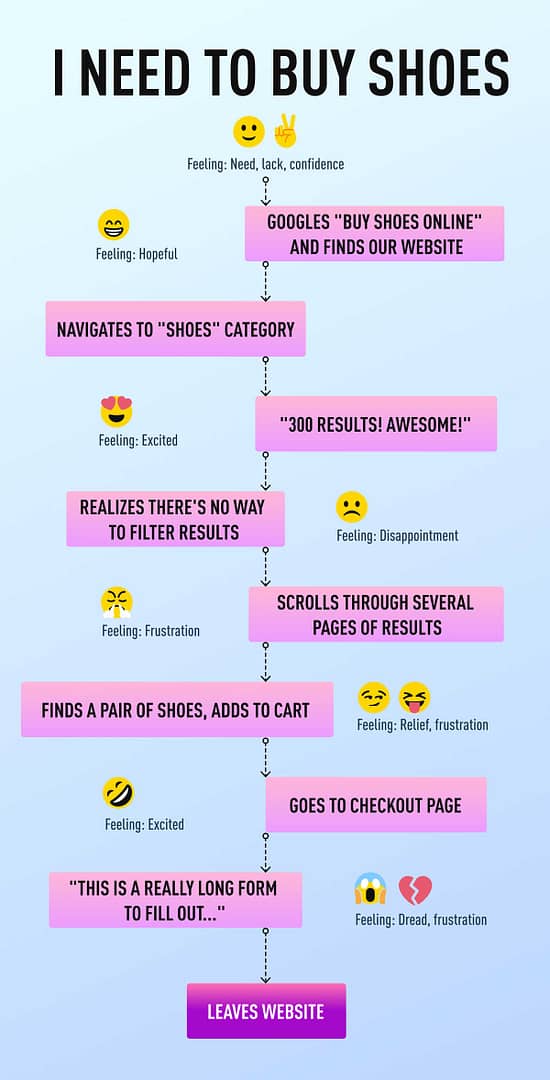
I love this example of a bad user experience from CareerFoundry.com**:
But there is so much information online about, and associated with, the UX process (customer interviews, persona planning, customer experience journey planning, site architecture, wireframe planning, prototype planning, prototype testing), and it can be confusing and hard to understand.
Absolutely UX design for apps can be extremely complex and require intense and extensive planning, but I think UX design for marketing websites can be overcooked.
And while the KISS methodology isn’t the best approach either, hopefully this article will help to simplify what UX design might look like for a simple marketing website.
Back in the early 2000s, UX design wasn’t really a thing yet, but while other web companies and marketing agencies were saying “you have three boxes on the homepage, what content do you want to put in them?”…
… we were asking questions about who their customers were, what were they looking for, what they really cared about and what would give them the confidence to enquire/buy – and THEN we worked out how many boxes were going to be required 🙂
But seriously, our point of difference in the market at the time (and remember, this was 14 years ago) was that we thought deeply about the customer (user) before we started on any design work, and that approach hasn’t changed in 14 years:
How will the user find you, and where?
- Will they Google your business specifically?
- Will they Google something you offer? And if yes, what is that likely to be?
- Will they see Google Ads when they search?
- Will they find you in social media? If yes, on which platforms?
- Will they receive email communications from you?
When they find you, what will they see in order to feel confident that you can help them?
- What do your organic search results need to say?
- Do you have content on the website that relates to what they are searching for?
- What landing pages will be required for your PPC campaigns and what information do they need to have?
- What content will your social posts and email comms link to?
How do you get them to enquire/buy?
- Do they have all the information they need to make a decision?
- Do they need social proof to enquire/buy?
- Have we done everything we can to convince them?
- What call to action makes the most sense/is the most compelling?
And often the most important (and forgotten) part – what happens next?
- What do they need to see/receive to be reassured the transaction/engagement was successful?
- How can we make them feel good about their decision?
- How do we start a life-long, meaningful relationship with this new customer so we keep them?
(NB. I might address this question in a future blog post as it’s a big job in itself).
Once the answers to these questions are discussed and understood, it gives our client and our team a much deeper understanding of the work that needs to be done.
So usually, we then jump to the whiteboard, thanks to COVID we sometimes jump onto Mural, and we start mocking up the structure of the wireframes, focusing on:
- Page hierarchy which is determined by the priority of information – what does the user need to see in the first viewport (screen view), where should the call to action be, are they on mobile or desktop etc
- Page interactions – how do we clearly/easily navigate the user between the pages of the website

Once this important groundwork has been done by the client and the team, the designer steps in and creates wireframe prototypes in tools like Photoshop, or more recently Sketch and Figma.
This is where the website and the user experience really starts to come to life and everyone can get a proper feel for how this website is going to look and work. We load the wireframes up to Invision as a prototype:

So how do we know if we have delivered a great user experience? We test it! And the client can test the prototype with their customers to find out if the planning work has been spot-on, or:
- What did we learn?
- What changes need to be made?
- What didn’t we think of?
- How can we improve the user experience?
And then we rinse and repeat until we are all satisfied that the solution meets the need, and most importantly that we have delivered a truly GREAT user experience. NB. Concept design and content (visual and written) also plays a massive part in achieving this result!.
If you are interested in how you can create a better user experience for your customers and prospective customers, get in touch with me.
*business.linkedin.com/talent-solutions/blog/trends-and-research/2020/most-in-demand-hard-and-soft-skills
** careerfoundry.com/en/blog/ux-design/what-does-a-ux-designer-actually-do/
