It’s 2021 and by now you are most likely aware of the fact the mobile has become very important for website owners.
In fact, mobile devices accounted for over 54% of the world’s website traffic in Q1 of this year.
It is clear that mobile is no longer the afterthought it once was and therefore we all need to take it seriously.
Your brand and mobile
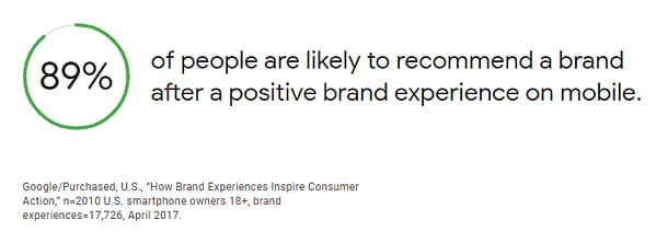
It makes sense that people are more likely to recommend a brand after a positive experience on their mobile site. A website that is not responsive can be a frustrating battle of swiping and pinching that leaves the user feeling lost and unable to achieve what they want to.
Backing that up, when people have a negative brand experience on mobile, they are 62% less likely to purchase from that brand in the future than if they have a positive experience.
So no matter if you are a glass-half-empty or glass-half-full person, the data unequivocally points towards having a better mobile site.
The “I want to buy” moment
Obviously a big part of the web is buying things and as the usage of mobiles goes up, so too does the confidence of consumers to purchase items online via their mobile devices.
A key part of a customers journey is the “I want to buy moment”. This is the moment where a consumer decides to put dollars behind their decision to purchase an item and initiates the purchasing journey by jumping online and researching products. Can you guess what device is most commonly used in this scenario?
Mobile phones, of course!
In fact, 65% of people use their phones in these moments.
Mobiles Influence
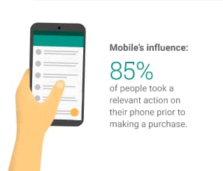
It’s not just the “I want to buy” moment that consumers use their mobile devices for. It’s all of the actions a consumer can take that lead up to a purchase that influence their decision.
85% of people took at least one of these relevant actions on their phone prior to making a purchase. That’s huge, and well worth keeping in mind.
What can we do about it?
Hopefully the previous paragraphs have convinced you that your website’s mobile version is actually quite important. If so, you may be wondering what you can do about a website that perhaps doesn’t look so great on mobile.
Well there are a couple of options that you may want to pursue:
The most obvious is to add some responsive styling to your website. This option will make your website usable on mobile devices and will dramatically reduce any user frustration when using your website on smaller screens.
The second, is a full rebuild of your website. Quite a bigger job than the first but a more comprehensive option that will offer greater improvements to not just the responsiveness of your website but its all round abilities.
Whatever option you take, you can be guaranteed that your users’ experience on mobile will be greatly improved and that your business will reap those benefits in the form of more sales or enquiries.
If you would like to know more about mobile-friendy website design, please get in touch with us today.
