When using an app or a website as a customer, we want to feel like the experience was designed specifically for our device. We want to feel like the site works naturally and seamlessly, and not that it has just been stretched or smushed into our device.
We live in a world where instant gratification is the norm. If we don’t get the information we want right away we move on to something else. Nothing puts us off a product or website quite like bad usability. We want to be able to read the text, click the buttons, find the prices.
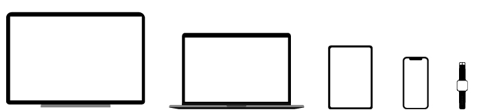
In order for us to create the best UX for the customer, it’s important to develop a plan to target the range of devices and screen sizes efficiently and effectively.
1. Identify the main device
Each app or website we create will have a core user experience.
There will be the one device it will be primarily used on and for. The first step is to define which main device (or group of devices) is most appropriate. By using this as a starting point we are making sure the users are getting the correct user experience that they require.
More often than not the app or website will be primarily used on one or two groups of devices. Not all of them.
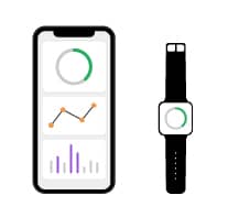
For example, your fitness tracker app.
It’s highly likely that you check your fitness habits on your mobile device first and foremost. You’re on the go, at the gym, in the park. You want all the information to be highly accessible. When you view your information on your smartwatch, you just want key snippets of the information. Heart rate, steps, workout duration, not all the graphs and data. This app will work best on handheld smaller devices but won’t need to work on desktop size as no one will be viewing there.
2. Adapt content based on device
After the core devices are defined, next we need to select the core content.
Just as the example above, you don’t want or need to see the graphs on your smartwatch, you just want the basic information. By finding out which information users want to see we will be able to create a more user-friendly and goal-focused solution.
Not all features make sense on all devices. Desktops have a much larger area to play with than mobiles. You have more space for fun design elements on desktops to wow the user such as images, animation and videos. Whereas mobile users don’t want to see a lot of this. Mobile users want information fast. Be strategic with which content you include on your mobile designs to ensure users don’t get lost and frustrated with animations you have on your desktop site.

3. Positioning content based on device
Content on your mobile devices may also need to look and act differently to their desktop versions.
Editing element proportions, positioning and content will ensure your users have an on-point user experience
When designing for mobile devices, ensure all your content and touchpoints are in the “safe area” of the device. Users pick up on it pretty quick if they have to stretch to click the menu or have to use both hands to click through content. This also goes for buttons that are too small to click and that are too close together.
Give your elements breathing space and ensure they are the correct proportions for the device and users.

4. Consistent & seamless experience
Build user confidence in your brand by staying consistent.
A consistent experience means that although some content is different, the overall experience and feeling of the site is the same across your devices. Users are constantly shifting between a few devices on a daily basis, this makes it easier for users to interact and engage as they know what to expect if they have used the site or app before.
When designing your apps and websites vital to keep the end-user in mind, how they use their device, what information are they wanting to see and ensuring consistency throughout devices.
The goal with any online experience is to make it simple and effortless for your users to find what they want and get where you want them to go.
