Last Wednesday night Rachel and Jason Juno from Coast & Co hosted the first ever Design Assembly event in Hawkes Bay with a screening of the indie film ‘Helvetica’ released in 2007.
Let’s set a few straight.
- Yes, this is indeed a documentary about the font Helvetica that is available on your computer.
- Yes, I get kicks out of type but I wouldn’t consider myself a type nerd.
- And yes, creating a typeface is a full-time profession.
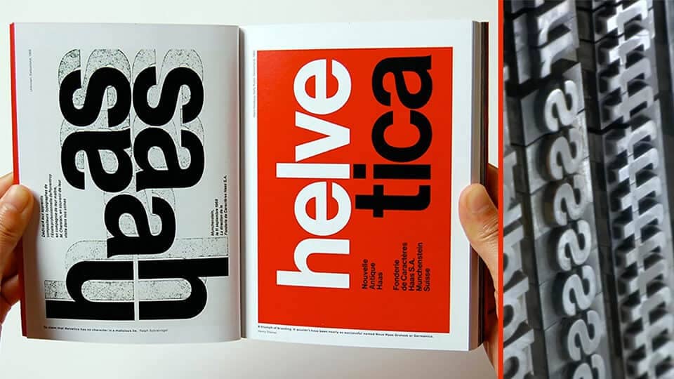
Everywhere you look you see typefaces and Helvetica is probably the one you will see the most. It’s ubiquitous. You couldn’t escape it if you tried. It’s on your computer, every street corner and is used at some point or another across government and corporation communications. As Jonathan Hoefler mentions in the film. “It’s like off-white paint. It’s just there.” The film explores the idea of why it is so widely used and how type affects our day to day lives through design, advertising and communication.
Helvetica, originally named Neue Haas Grotesk in 1957, became popular during the early 1960’s with it’s neutral, systematic and machined evenness designed with the desire of having better legibility across the entire alphabet. This was a breath of fresh air in commercial marketing and advertising where it seemed graphic designers were intentionally trying to see how many different typefaces they could squeeze into the 1 ad.
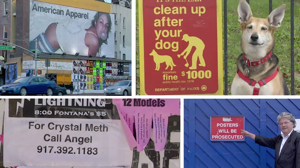
The way something is presented to us will determine how we react to it. We touched on how ‘first impressions matter’ in our article the importance of good brand design. Most people won’t consciously be aware of a certain typeface but the different style and characteristics of a typeface can be the biggest catalyst in our emotional response to a piece of communication. For example, an ad for jeans paired with Helvetica will imply that the clothes are modern, smart and safe. The same ad paired with a grunge-esque typeface will draw images of ripped and rugged.

And here is where Helvetica’s strength lies. By having a neutral typeface it doesn’t bring any potential unwanted connotations with it. The meaning is in the context of the text itself and not in the typeface. It’s not often that a design can truly stand the test of time but Helvetica is certainly a good example of this.
“If you do it right, it will last forever. It will last forever”
Massimo Vignelli – famous for designing the American Airlines logo and New York city subway signs

Thank you to Rachel and Jason for organising the event.
Catch you at the upcoming Horror movie ‘Comic Sans’.

