First impressions matter. Call it a gut feeling or intelligent unconsciousness, but when we first experience a company, we make an immediate judgement, setting us on a certain direction.
We all understand the concept, but if you’re making an investment decision for your business, how do you work out what your brand is actually worth?
The concept of ‘brand equity’ has been around for over a decade. “There are numerous such instances of ‘twins’ all around us—products that are identical except for the branding, where one brand sells much better than another,” says V. ‘Seenu’ Srinivasan, the Adams Distinguished Professor in Management at the Graduate School of Business. “Having a better product or a larger sales force is not brand equity,” he explains. “Brand equity is that incremental value that accrues to a product when it is branded’”. Simple brand awareness is one source of brand equity. “If you can get your name to pop up in people’s minds when they think of the product category, you’ve won a big part of the battle,” he says.
The challenge is, often those early assessments can come from something as little as a glance, eight seconds or less – be it flicking through a magazine or browsing online. Having a customer remove us from there consideration here is harsh, but this is why it is so crucial that your company sets the right impression from the start, and it all begins with the design of your brand.
A brand is not simply its logo or ID system, it is everything it does. Messaging, imagery, photography, product, experience and interactions are all part of the design of your brand. A 90’s looking logo can be perceived as a company stuck in the 90’s. Messaging that doesn’t reflect the personality of a business can come across as cold, generic and lifeless. Design should be used to continually reinvent the brand – to stay up-to-date and modern.

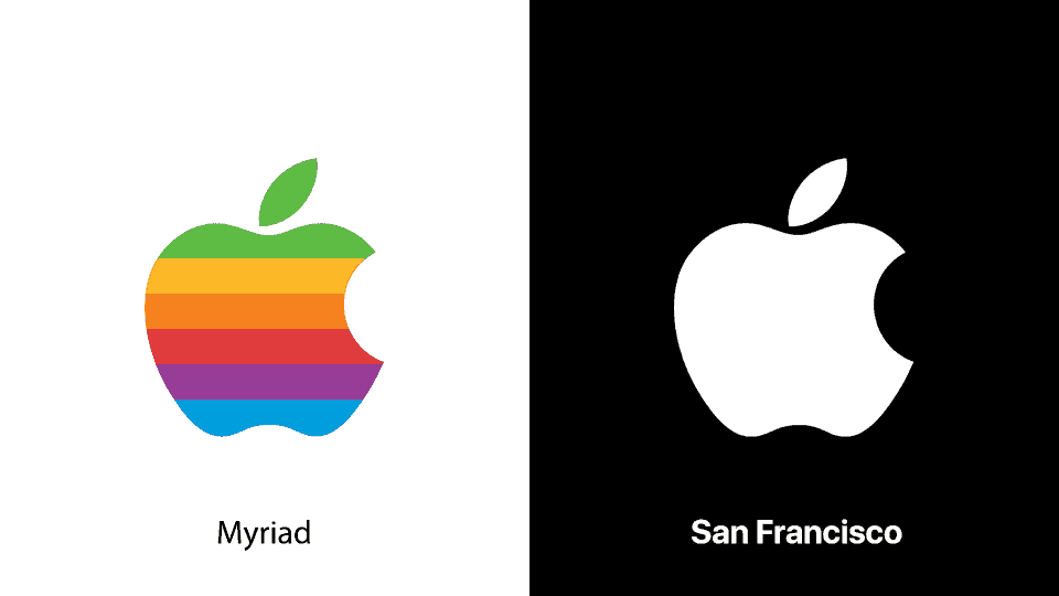
Brands continuously reinvent or reinvigorate themselves. As trends and technology shifts, so do brands. Not doing so runs the risk of being perceived as outdated. There is a misconception that a brand refresh will be a costly exercise. That it all needs to be burnt down and started again. However, often something as simple as a new typeface or colour scheme is all it takes. Take Apple for instance. Their half eaten apple previously had every colour in the rainbow, now their logo simply uses a monochromatic colour scheme to achieve a more modern look. And typeface? Since the early 2000’s apple has changed their marketing typeface three times.
Here are a few quick design principles we have at Mogul for our brand design:
- The design should reflect the essence and personality of the brand.
- It should be strategic from the outset.
- Less is more. A simple logo is more likely to work across multiple platforms and be easily recognisable.
- A brand is more than a name or logo as mentioned before.
- Design for people. The best way to connect with people is through emotion. We are all emotional people – except for Spock.
- The name is final. Make it easy to pronounce, spell and remember.
If you’re looking at your own brand identity and thinking ‘Yeah, that seemed like a good idea ten years ago’ or you’re planning on setting up a new business and need help, then get in touch. We offer a range of branding options and have an experienced team of designers who will help you through the process – all we require from you is a bit of your time upfront to ensure we understand your business. If you’re interested in hearing more, give us a call or drop us a note – we’d be happy to discuss your needs and provide some advice!

