As a web designer, one of the most common UX comments that I’ve heard during my 9 years in the industry is “Can it be above the fold?”. This assumption about user behaviour still plagues conversations on design and it’s time to put it to rest.
What is ‘the fold?’
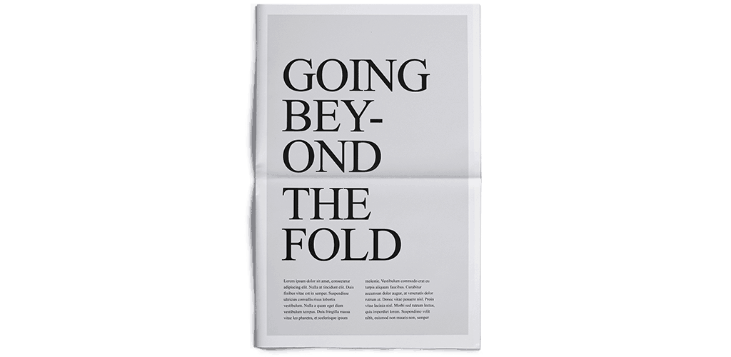
‘The fold’ is a dreaded term borrowed from the print world. The expression came from newspaper printing and refers to the viewable portion of the front page when folded. Anything ‘above the fold’ was considered prime real estate and, of course, newspapers could charge more for any ads that appeared here.
This concept was adapted and clung to for early web design, and ‘above the fold’ expanded to mean everything a web user sees before scrolling, often stuffing “important” content (along with the kitchen sink) at the top of the page so it would appear without scrolling. The concern was that users wouldn’t scroll and so any content below the fold would be missed.
Where is the fold on the web?
In the early 2000’s we only had a handful of screen sizes and two ruling browsers to contend with, so defining a standard viewport height to determine where the fold actually is, was a lot easier. Now we have a plethora of screen sizes, an excessive amount of browser toolbars and add-ons, and, of course, mobile/tablet devices. What might be the fold for one person may be entirely different from that of another person, even using the same device. So trying to determine the location of ’the fold’ is now utterly impossible.
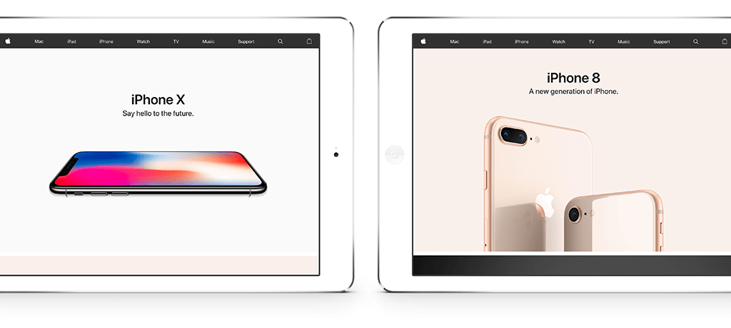
Apple encourages scrolling by ensuring a portion of the next section is visible on the screen
A study by ClickTale found that in a sample of about 120,000 page views from around the web, 76% of pages with scrollbars were scrolled to some extent and 22% of those scrolled all the way to the bottom. Another interesting behaviour was that users would scroll to 90% or more of the page just as often on longer pages as they did for shorter pages, showing that there isn’t an absolute drop-off point after which users get tired of scrolling.
It’s all about motivation
The concern that users won’t actually scroll beyond what they first see goes against human behaviour. If a user has made the effort to visit your website, they are not going to abandon it just because the first thing they see is not what they are looking for. We don’t wait in line at a cafe and then decide to leave just because the first item on the menu is a tuna sandwich.
“Users do scroll, but only if what’s above the fold is promising enough. What is visible on the page without requiring any action is what encourages us to scroll.”
—Nielsen Norman Group
First impressions are always important and having a clear content hierarchy for what you want users to focus on is key to helping with longer content pages. If you don’t know what to prioritise then get in touch with the Mogul team and ask us about a site audit.
As a designer, I’m not saying that we shouldn’t consider ‘the fold’ or that it no longer matters, but let’s not squeeze space and cram multiple calls-to-action (CTAs) up there in the hope of finding the golden ticket. High conversion rates have less to do with whether a button is above the fold, and everything to do with the content supporting it. We know that people actually do scroll – so let’s create thoughtfully-crafted content to compel users to take that next step, long or short.
