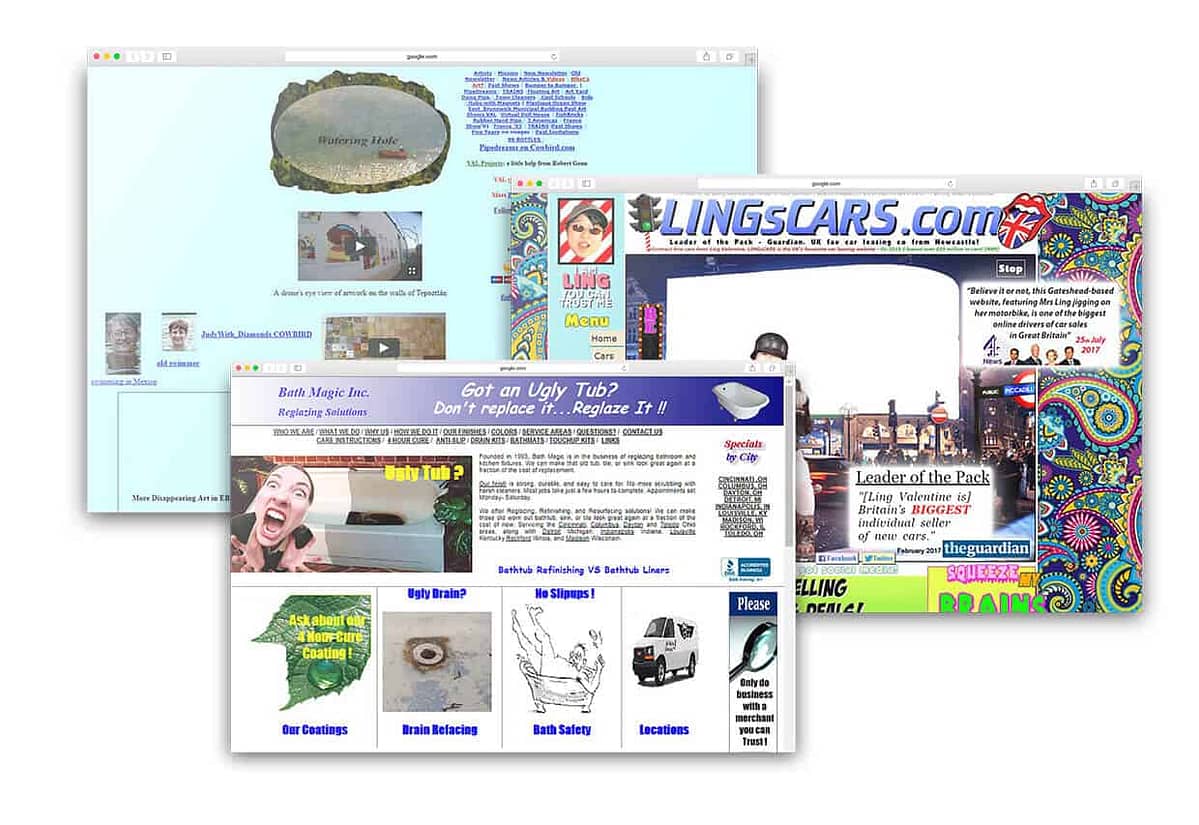
It’s something that we’ve heard before – that functionality must come before form, that the way a website works is more important than how it looks – and to a certain extent this is true, but something that we need to keep in mind is the role of the designer in all of this – the role of bringing form and functionality together in a way which is clear, compelling and precise, so of course, aesthetics play a big part in this.
But first and foremost, a website exists to serve a purpose – whether it is to share information, to generate sales or to allow people to connect with each other – websites always have a goal, or perhaps, a function. At its core, design is about problem solving – what is the most effective way that users can find the content that they’re looking for? How can we drive users towards purpose? How can we facilitate ease of communication? A web designer look at these problems, and keeps them in mind as a website is designed.
Beauty is something subjective, and to an extent so is good design, but while an individual may have their own ideas about beauty, good design is something almost universal, it’s something that is going to work for most users. If a website is easy to navigate, has a straightforward user experience and effectively carries out its intended purpose, then this in itself is something of beauty. Creating something visually beautiful for the sake of beauty is never the goal of good design, but it is often simply a by-product of a website being well designed.
Even so, lately disruptive, “brutalist” design has been making an emergence – throwing aside the conventions of good design to instead embrace the ugly. To an extent, ugliness can be used to draw attention – the most infamous example being Ling’s Cars, which is a website well known simply because of how terrible it looks. In order for this kind of approach to work, one must go all out, purposefully going against everything which has already been proven to work in the hope that this intentional complete disregard will generate some sort of fascination. But often this ignoring of design conventions is not intentional at all – in fact as I was in the process of writing this article I was linked by my sister to this website. I don’t imagine that the creator of this website was trying to draw attention to the website via its poor design, and was likely not even thinking about how the design would impact the user experience. Websites like this are both ugly to look at and confusing to use, and in the end, perhaps these things are both one in the same.
By arranging content in a way which makes sense, using colours and typefaces which are easy to read, using a layout which effectively guides a user to the intended destination – all of this may seem simple, but often the result is a website which is beautifully designed. So does design need to be beautiful? Not necessarily, in fact focusing too much on creating something visually beautiful can lead to a website which is confusing to use and has a poor user experience, but when the focus is on creating a smart solution to a problem, the results are more often beautiful than not.

