Before we dive deep into the “how-to” section of this blog there are a few things we need to really understand first to be able to make the best decisions about how to create a colour palette. Choosing colours for your brand or business isn’t just about picking the colours you like, but more about who you are, what you stand for, and who your audience is.
Understanding what type of business you are, and who your key target audience is, will help you to choose the best primary colour for your brand. This choice has the potential to influence buying decisions, the mood and behaviour of your customers, and also how your brand is perceived in the market – so it’s important to set the right mood and tone in your brand and brand collateral.
Each colour has a different meaning and strikes different emotions with different users, depending on their experiences, and other relationships they have had with similar colours. Although each individual is different, there are some general associations (which are quite often linked to company values) to each colour below:
 Blue – Trust, Smart, Calm, Stable, Power
Red – Love, Immediacy, Energy, Passion, Anger
Black – Bold, Rich, Power, Elegance
Green – Soothing, Natural, Jealousy, Balance, Eco
Yellow – Cheer, Attention, Childish, Warm, Energy
Orange – Health, Attraction, Wealth, Innovation, Creativity
Once you have picked an overall brand colour, we can start creating a colour palette. Below I will walk you through the steps to create and apply a colour scheme to a mock-up interface using complementary colours.
Step 1
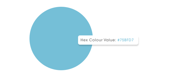
Start by selecting your main colour.

Step 2
How to select your secondary colour.
Duplicate the main colour and change the colour mode to HSB in your colour picker.
Set the saturation between 5-10 and the brightness between 95-100.

Step 3
Now for the accent.
There are a few options here depending on the outcome you want. For this one, we are going to use a complementary accent colour which means we choose the colour directly opposite on the colour wheel.
Get creative and adjust the saturation/ brightness to suit. In this example, we added 50 to the saturation.

Step 4
Now we have a colour scheme, let’s try to apply them using the 60-30-10 rule. The 60-30-10 technique is a classic colour application rule that is meant to give balance to the colours. This formula works because it creates a sense of balance and allows the eye to move comfortably from one focal point to the next.
The main colour should be the dominant hue and make up 60% of the interface. 30% of the interface should be the secondary colour and the last 10% should be the accent colour which is ideally used for CTAs (buttons) and links. The high contrast colour will give users a clear direction of the intended user flow.

Let’s see how it works with existing brands?


Colour is a tricky concept to master, especially in digital applications. The tips above will help you get started in picking the right colour for you. If this all seems a bit much then don’t worry, we are here to help.
At Mogul, we know the ins and outs of colour theory and can help you choose the best colour palette for your brand and values – if this is something you would like some help with, get in touch!