
Every so often I’m asked how long it will take to ‘add accessibility’ to a site. This post is intended as a bit of a guide as to why the question doesn’t really make sense, and what accessibility means in practical terms.
Firstly, accessibility isn’t a set of features; it’s not just adding alt text to images, or choosing good combinations of colours with plenty of contrast (although those are important things to do).
As digital.govt.nz puts it:
Web accessibility is about inclusion – making sure everyone, including disabled people and those using assistive technologies, can access online information and services.
Inclusion starts well before your website. It needs to be part of your brand and values, which informs your website and all your other channels.
Mogul has conducted accessibility audits and implemented the findings from external audits. These pick up common issues like missing alt text on images, generic button labels and inconsistent heading structure. These are all pretty easy to fix, but there are much more fundamental accessibility and inclusion issues which can be difficult to fix because they are baked into the brand.
Every choice you make, from the colours and fonts you select to the tone and language of your messaging will send a signal about who your brand is for.
Organisations which value inclusion make it part of everything they do.
What makes an accessible brand?
That might all sound quite abstract, but there are some basic practical things to consider in your brand development:
1. Colour and Contrast
Your brand palette sets the tone for everything. Light greys on white might look sophisticated, but they’re difficult to read for many people, especially those with low vision.
A good brand palette builds in a decent level of contrast between the different colours. When text of one colour is set against a background of another colour (or white), it requires a certain amount of contrast to be readable. The size and weight of the text matters too.
Black text on a white background (or vice versa) offers maximum contrast, but your palette will usually need a bit more than black and white in it.
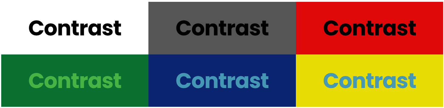
You can actually quantify colour contrast as a simple number, so it’s not hard to see what works and what doesn’t.
2. Typography
Fonts and typography have a number of jobs. They need to look nice, but they also communicate information and show the hierarchy of what is important and what is detail.
Ornate fonts may be beautiful and save the designer from the agony of more Helvetica, but they can exclude readers with dyslexia or visual impairments. Legibility, line height and spacing should be part of your typeface choices, and the way you structure headings can affect how easily a machine (search engine or LLM) can understand the content.
That doesn’t mean everything has to be Times New Roman, but you should be selective about how you use highly-decorative fonts. Use them for decoration rather than critical function.
3. Tone and Messaging
Accessibility is about more than visuals – it’s also about language and communication.
Jargon, idioms or overly complex phrasing can confuse or alienate people. Inclusive messaging considers readability, comprehension and the diversity of your audience. Generally the simpler you can make your message, the better it will be understood by everyone.
The old adage of pitching your writing for an audience of 12-year-olds is still good advice. Use language that is clear, direct and simple, without unnecessary jargon or complex sentence structures.
4. Motion and Visual Effects
Animations, parallax scrolling, or flashy transitions may delight some users, but they cause discomfort for others.
Set guidelines for motion that respect people with sensory sensitivities, while still delivering personality and style.
5. Imagery and Iconography
Accessibility in imagery means thinking inclusively about what and who you choose to show.
Stock images that lack diversity, icons that aren’t clear at small sizes, and graphics that rely solely on colour to convey meaning all create barriers.
The payoff
Building accessibility into your brand is the right thing to do, but it’s also smart business. People with disabilities are customers and clients too.
Inclusion comes with some important advantages:
1. Broader reach
Accessible design opens your brand to more people and allows them to engage with your content. That includes people with disabilities, but it also benefits anyone reading on a phone, in bright sunlight or with limited attention.
2. Better communication and user experience
Brands that prioritise accessibility are showing care and professionalism. People may not consciously notice your content is easy to read and understand, but that’s actually great. The content is there to convey a message, so the more seamlessly and transparently it does so the better.
3. Competitive advantage
Not every brand considers accessibility and many only address it superficially.
If you embed it into the way you do things, you differentiate yourself as a business or organisation that genuinely cares about people, giving you an edge in both audience perception and compliance readiness.
Conclusion
Accessibility is not a checklist or something you add at the end of a project. It’s not a cost, or an optional feature. Make it a mindset which guides your brand in a much more fundamental way.
If you treat it as a value, it shows up naturally in your website, your campaigns and every way people experience or interact with your organisation.
