Did you know that these days, almost two thirds of all web traffic is generated by people using mobile devices (Statista, 2019).
You may remember that we’ve spoken about the importance of having a website that is mobile responsive in the past, both in relation to website design and development and also in light of Google’s confirmation that it will not have separate rankings for mobile-responsive and non-mobile responsive pages in favour of a single ranking system that does prioritise responsive over non-responsive results.
But today, I want you to think about the importance of having a mobile responsive site from your customer’s point of view.
You didn’t build your website for the fun of money spent and content management, I’m sure. Your website is there so that your customers can find your business online and take the first step towards experiencing why you offer superior services to your competitors. We can bang on about Google’s preferences, and the joys and challenges of mobile design until the cows come home. Ultimately, your customers are the most important people for you to please.
Wait! What do you mean “mobile responsive”?
We’ve all had the experience where we’ve tried to load a website on our phones only for the text to be so tiny that you almost need a microscope to read it.

Once you’ve zoomed in enough to make the text legible (if you even persevere that long) good luck navigating! You’re more likely to accidentally select a link three lines of text below than the one you intended.
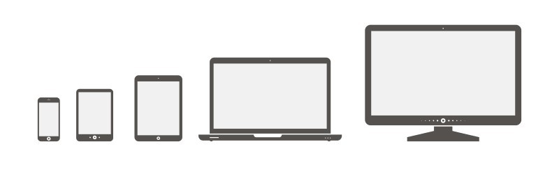
This is what happens when a website isn’t designed to respond to the multitude of screen sizes available to users today. The challenge is to make a website that not only works on a mobile phone, but that can also be dragged from a laptop screen to a 63″ television screen without breaking or interrupting the customer’s experience.
A mobile responsive website means text that be easily read, images that load quickly and a menu that doesn’t end up with three buttons all layered over the top of each other.
So, what does it mean to your customers if your website isn’t mobile responsive?
Not responsive = don’t care?
Your website is your business’s virtual shop front. Put yourself in your customer’s shoes, would you go into a shop with dirty windows, missing lightbulbs and a general air of being neglected by the owner? Almost certainly not. You’d go a little further down the street to a competitor offering a similar product from a clean, well-lit premise.
The same applies to your website. Studies have suggested that 48% of users feel that businesses without mobile responsive websites simply don’t care (Blue Corona, 2018). In a world where it is estimated that 94% of all small business websites will be mobile responsive within 2019, your business can’t afford to give the impression that it’s not well maintained, or doesn’t care (Clutch, 2018). Your customers have too many alternate options available to them.

No customer forgiveness
You only get one opportunity to make a first impression. If that impression isn’t responsive, you may well permanently lose business. Global management consulting firm, McKinsey & Company found that not only will 60% of Google users not bother returning to a website previously found to be unresponsive on their mobile device, but 40% will take their business to a competitor instead (McKinsey & Company, 2014).

Your customers want it to be easy to work with you
A happy customer spends more (Harvard Business Review, 2014). A happy customer is one who has had a pleasant experience. Using a website that has been properly optimised for mobile devices while using a mobile device is an enjoyable experience.
Make your website an enjoyable one to use, and reap the benefits (Snap Agency, 2015).
What if my website isn’t mobile responsive?
In the words of the great Douglas Adams: Don’t panic.

If your site has been built in recent years, chances are it already is mobile responsive to a degree.
However, as more devices at a greater range of resolutions are released, it’s always worth checking to be sure. You can do this yourself with Google’s Mobile Friendly Test.
If you didn’t get the result you want? Mogul can help! Get in touch with us today to learn how we can help your site become more mobile.
