So you’ve just received your shiny, brand new website, ready and waiting for you to jump in and add your own content… but wait just one moment! Before you jump in and (potentially!) make a mess of everything, make sure to consider the following when choosing your content.
Something I have learned while working as a front-end developer is the importance of choosing great content for a website – it can be the factor that makes or breaks a website. It can at times be disheartening to see a design I was somewhat proud of ruined by poorly chosen content, but from a less self-centred perspective content selection can have a huge impact on the ease with each user interacts with your website.
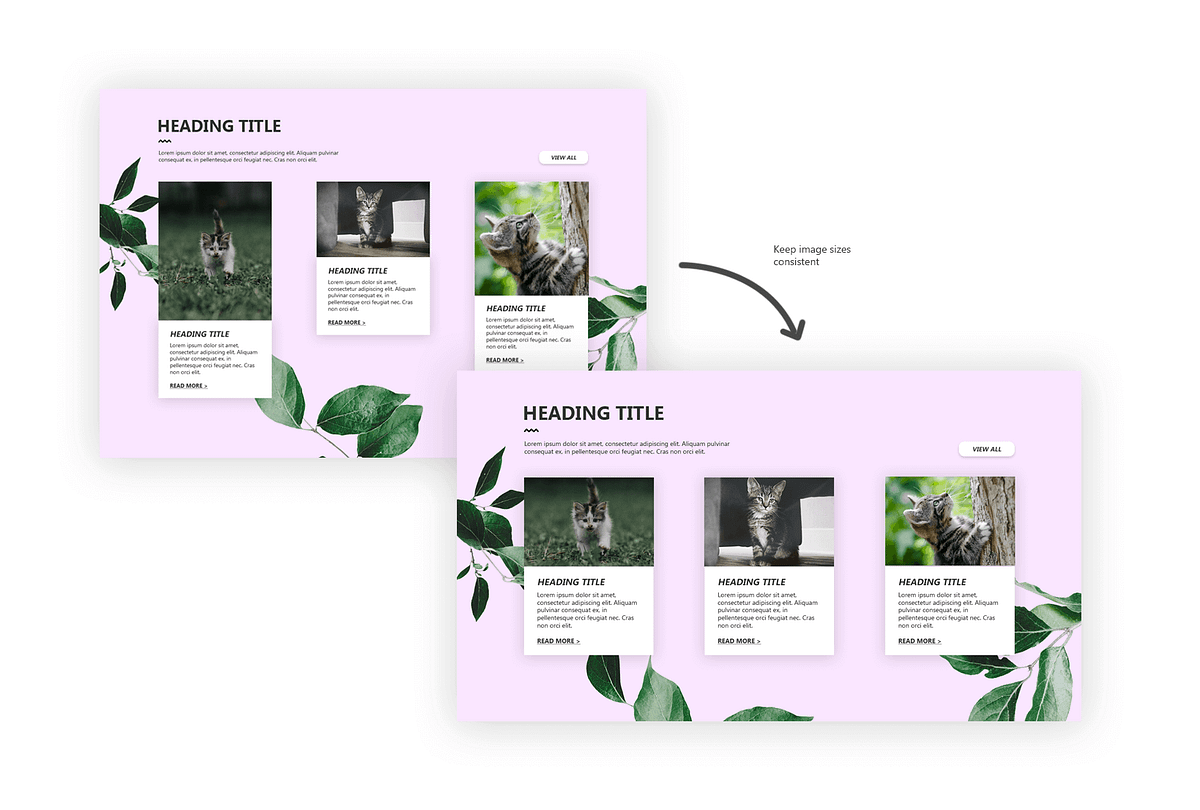
One of the biggest problem areas that becomes apparent in the content loading process is around images – images being the wrong size, too small or too big, being too generic or irrelevant to the content, having inconsistent aspect ratios or simply being put in places they don’t belong.
When it comes to making your website stand out from the rest, it is important to avoid using very generic-looking stock images. Stock images can, of course, be effective when carefully chosen, but using your own original photographs (relevant photos of course) will always be a way of setting your website apart. Of course, at the same time, you want the photos to look professional; slightly blurry photos taken with your mobile phone are never a good idea, so where possible, make sure to get photos taken by a professional photographer.
When selecting images, pay attention to the placement and dimensions of placeholder images – these are not simply there as decoration but serve as a guide for the sizing and orientation for images that you will be replacing them with. For example, if you have a tiles layer which consists of landscape images, heading text and copy – this format should be stuck to. If you start loading up a combination of landscape and portrait images instead, things are going to start looking messy.
Keep an eye on the file size of the images you’re uploading too. While it’s important to use high-quality images on your website, we’re talking “high-quality” within reason.
Images can easily be resized and cropped using a program such a Photoshop or even Paint, but you can also use websites such as imageResize.org to crop images down to size and compress them so that file size isn’t too large.
Keep in mind that there are always alternatives to photography. Solid colour blocks, gradients, patterns, illustrations and icons can all be used to give a website visual interest when relevant, original photography is not available.
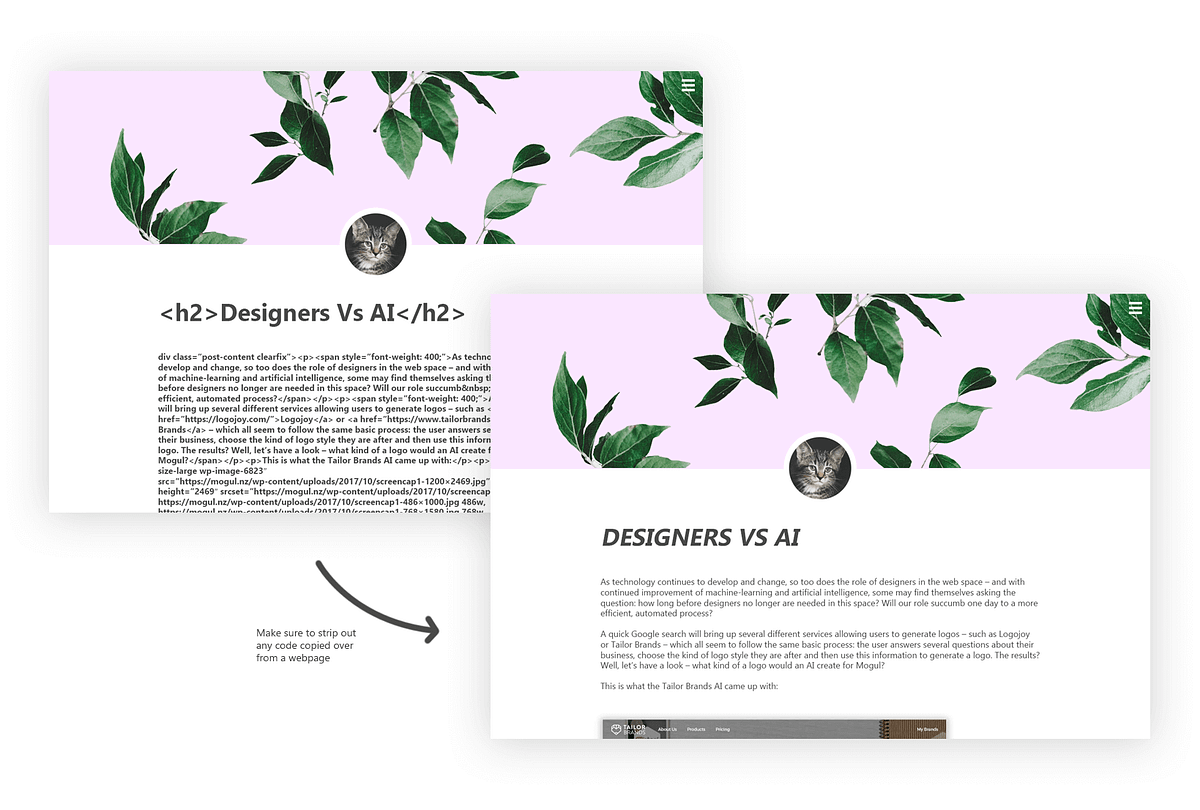
While images tend to be the biggest sticking point, text content can also create some issues at times. Especially when it comes to blog content, if you’re posting the content in multiple places it can be easy to simply copy and paste the text from other sites – especially social media sites such as Facebook. Doing this can result in bits and pieces of leftover code making its way into your blog post. However, this doesn’t mean it’s entirely impossible to copy and paste text content from webpages without it causing problems. This can easily be remedied by pasting the copied content into a plain text editor first (e.g. Notepad or TextEdit) to strip out any copied code or styles.
Keeping the structure of text content the same throughout your website is a good way of getting a consistent look and helps with readability. Appropriately using heading styles is a good way of creating hierarchy throughout a page.
Images and text are of course only two types of content which can be used to populate your website, but being the most common it is important that they are done right. Always remember when choosing content for your website that – no matter how beautiful the design is – the content you select will have the final say in how good the design truly looks.
